Field notes · Key art
Movie Poster Design for Streaming: A Key Art Director's Guide
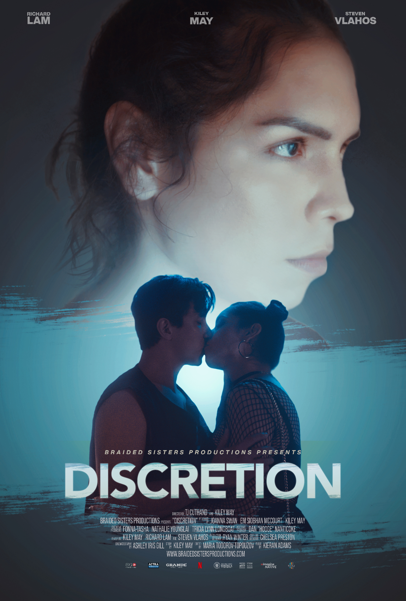
Eight years designing movie posters and streaming key art — including work licensed to Netflix on Discretion and Disclosure. Here's how modern movie poster design actually works when the thumbnail has to earn a click on a 55-inch TV and a phone in the same week.
What is movie poster design?
Movie poster design is the discipline of compressing a two-hour story into a single frame that makes a stranger stop scrolling. For theatrical releases the poster has to hold up printed six feet tall on a bus shelter. For streaming, the same idea has to survive being cropped into a 400-pixel tile inside a Netflix row, an Instagram reel-cover, and a YouTube thumbnail on the same day. That constraint rewrites the rulebook.
Theatrical vs. streaming: the real difference
A theatrical one-sheet gets its own wall. A Netflix tile fights nine other tiles in the peripheral vision of a viewer already three seconds from choosing a rewatch of something safe. Streaming key art has to work at three sizes without a redraw:
- Billboard (16:9) — the homepage hero. Cinematic, low text, the hero image doing the emotional lifting.
- Title card (2:3) — the traditional poster ratio, surfaced in "More Like This" rows.
- Square and vertical (1:1, 9:16) — social, in-app promos, mobile. Faces bigger, type shorter, safe area tighter.
The poster you finish is really four posters. Design the composition so the focal point survives every crop before you touch typography.
Technical specs streaming platforms actually check
- Resolution: deliver key art at 3840 × 2160 minimum for billboards; posters at 2000 × 3000 (2:3). Streaming QC teams reject anything upscaled.
- Color: sRGB, embedded profile. Studios like Netflix display everything on unmanaged consumer screens — CMYK proofs are irrelevant here.
- Type safety: keep title lockups inside a 10% safe zone from all four edges — platforms overlay their own badges (Top 10, New, HDR).
- Text density: billing block is optional or hidden on most streamers; use that reclaimed space for image, not legal micro-type.
- Localization layers: deliver a title-free "clean plate" version so regional teams can drop in localized logos.
Emotional storytelling in a single frame
Technical specs tell you what will pass QC. They don't tell you what will get watched. On Discretion — a psychological thriller picked up by Netflix — the brief was "quiet dread, not slasher." We rebuilt the composition three times to strip out anything that read as horror-genre shorthand. What survived: one face, half-lit, eyes cropped to the top third of the frame. No knife. No blood. The click came from what wasn't shown.
The same principle applied on Disclosure. The temptation on a courtroom drama is to lead with a gavel or a suit-and-tie composition. We pushed for a single hand, palm up, holding a document — a smaller gesture that made the stakes feel personal rather than procedural. Streaming audiences don't buy tickets; they give you a second of attention. Emotional specificity earns that second.
A working process for movie poster design
- Read the film, not the logline. The logline sells the marketing team; the film sells the audience. Watch a rough cut twice before opening Photoshop.
- Write three taglines before you sketch. If the taglines all describe the plot, the image will too. Write one about a feeling, one about a consequence, one about a question.
- Thumbnail on paper. Ten 2:3 rectangles, 30 seconds each. The composition that survives thumbnail scale survives everything.
- Photography or illustration decides the frame.Streaming rewards photographic realism for drama and thriller, illustration for animation and family. Mixed styles usually lose at tile size.
- Type last, and type quiet. The title lockup should never fight the image. On streaming, viewers already know what they clicked into — over-designed logos are a theatrical-era habit.
- Test at tile size before delivery. Export a 400 × 225 pixel crop and look at it on your phone. If it doesn't read, the 4K version won't either.
Common movie poster design mistakes
- Floating heads. The default lazy layout. It works in a theatrical marquee, dies in a Netflix row.
- Genre clichés. Red-tinted knives for horror, silhouettes-with-gun for crime. Every algorithm-driven row already has ten of them; you need one difference.
- Uncropped compositions. If the focal point is centered, cropping to 16:9 or 9:16 breaks it. Design off-center from day one.
- Illegible titles at tile size. Test a 60-pixel tall render before signing off. If you can't read it on a phone row, it will lose to titles you can.
- Under-delivering versions. One 27 × 40 poster is a theatrical deliverable. Streaming asks for 6–12 crops and a clean plate. Build for that from the start.
If you're briefing a designer
Bring one thing the film does that no other film in your row does. Not the plot. Not the cast list. The specific emotional beat that made you greenlight it. That's what a working movie poster design needs to make legible in a single frame — and it's the thing streaming key art is judged on when the algorithm decides whether to keep serving it.
Working on a film, series, or festival poster? Get in touch — or see recent key art on the Key Art page.